Modern vs. Postmodern Architecture

The r/architecture subreddit can be a lot of fun because of its constant discussion about the finer points of modern design. However, subreddits represent a limited medium when trying to express some of the complex graphical ideas inherent in the topic. This is due in part because the ability to pair text with graphics is itself limited, and secondly, overall I find the site more geared toward discussion than the delivery of theses. Certainly a lot knowledgeable people contribute to r/architecture, but one also finds a lot of trite statements. Because it’s a discussion board, it’s possible to ask follow up questions to determine if the statement was simply made in haste, or if the poster’s views really are that shallow. Unfortunately, sometimes it can be shown that a poster’s views really are that narrow-minded and superficial. Instead of fretting someone is wrong on the internet, we can expand on topics we enjoy here at our leisure.
That brings us to the main point of this article, and that is to put the subject of modern design into the largest possible framework so that its details can be appreciated. This careful analysis feeds forward into our proficiency at judging designs for their suitability in our communities and cities. In each of the six following examples we try to highlight something of the conceptual, and describe how that was brought into the physical, when comparing modern and postmodern architecture.

The Glasgow School of Art. Charles Rennie Mackintosh. Glasgow, Scotland. 1897.
I have yet to discover an earlier modern design that has aged so well. The rectilinear nature of its exterior can be recognized on the streets of many modern cities. The square mullions of the windows carried on into Frank Lloyd Wright’s work and then all the way to business parks across North America. Mackintosh’s other works better display their roots in the Arts and Craft Movement, but the Glasgow School of Art transcends this classification and boldly displays a style still desirable today. The building would not look out of place in any cities’ redevelopment plan, and I imagine many would prefer it to another characterless curtain-wall window system put up next door. The interior has more details which indicate its connection to the Arts and Craft Movement but is also fascinating for its contribution to advancing building systems at the time. It was one of the first buildings in the world to integrate central heating and ventilation in a way we would today recognize as modern, and also comprehensively wired for electric lighting, which was still a rather novel addition to a building at the time. The structure was struck by a large fire several years ago and is still under restoration.

Schröder House. Gerrit Rietveld. Utrecht, Netherlands. 1924.
This is not my favorite early modern structure but is an excellent example to contrast to later postmodern development. Architect Gerrit Rietveld’s Schroder House is such a complete break with the past it must of seemed nearly hallucinatory to pass on the street at the time. There’s a radical simplification of the building form seen in the design but also a playfulness in how the planes were placed. Modern architecture is rather a large category, and when the building was officially designated a UNESCO World Heritage site in 2000 it was noted the house was an excellent example of De Stiji. The neo-plasticism style had a large impact on later modern architecture with its focus on reductionism and abstractism. One can see on the exterior the placement of the planes emphasizes their independence, a further mechanism of reductionism. As we move later into the 20th century there seems less of a hesitancy to engage complexity to develop emotive textures and forms. There are some great 360° views of the interior online that show how clunky the interior looks to the modern 21st century eye, and overall I don’t think the building has aged as well as other examples on the list.

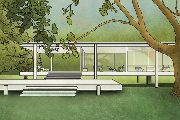
Farnsworth House. Ludwig Mies van der Rohe. Plano, Illinois. 1945.
In Architect Mies van der Rohe’s Farnsworth House we continue to see the purity of simplification expressed in structure. The interpretation of this structure was what initial drew my ire on Reddit. A supposed “architecture student” was advocating for a straightforward interpretation of this structure as a reaction to classical architecture. And yes we have columns. If only architecture was that simple! There are contemporary statements from Mies van der Rohe of his finding inspiration in Japanese architecture for his work during the period. Furthermore, author Georg Windeck puts forward a persuasive thesis that the structural materials and construction methods are also finely tuned to express the purity of the architecture as well. Any view of the house’s bright interior is inviting, but mental energy is needed to ignore the many practical limitations of such a design. Living in a fish bowl can be gureling and, furthermore, we ask for much better energy performance in 21st century buildings, of which a glass box inevitably fails without extra design work, though the small footprint is appreciated.

Georges Pompidou Center. Renzo Piano and Richard Rogers, Paris, 1971.
Now we arrive at the postmodern era. The Pompidou Center is a great example of the thrust of theory away from pure form. Here for the first time other themes are considered, such as putting the building services in full view of the public to show the truth of how buildings operate. I find the textures made by the complex exposed piping compelling, with the diagonal escalator adding movement to the exterior. Piano and Rogers created this wonderful structural cross bracing that I think makes the exterior even more unique. Keeping readers abreast of art history news: In 2017 it was announced the Center would undergo a $110-million restoration. It’s an important consideration for these high-concept, high-design buildings that the immense level of unique fabrication often requires decades later a higher level of maintenance as well. Though arguments continue to this day about the aesthetic value of this building’s approach, the building is an example of exactly the type of creative risk-taking that should be celebrated.

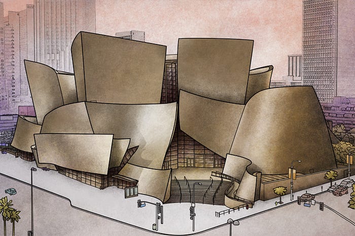
Walt Disney Concert Hall. Frank Gehry, Los Angeles, California, 2003.
Frank Gehry’s entire portfolio of work ebbs and flows, much the same as any artist who has a large body of work. With the Disney Concert Hall we see it at its height. The curvilinear form draws the eye from blocks away, and screams creativity because its form is just so unexpected. The movement it captures for a building is uncanny. The exterior, the texture of which hard to capture in digital art, is of titanium. Rarely used architecturally because of its expense, otherwise it actually has great characteristics for exterior use because of its lightness, strength, and resistance to environmental degradation. It’s a very stable material to use in any project, but hard to work with initially because of its strength. Many visitors to Gehry projects try to find direct representation and meaning in his forms. Gehry himself has stated his curvilinear forms are completely abstract. I’ve always liked this approach, and am happy to find meaning in its sculptural form myself.

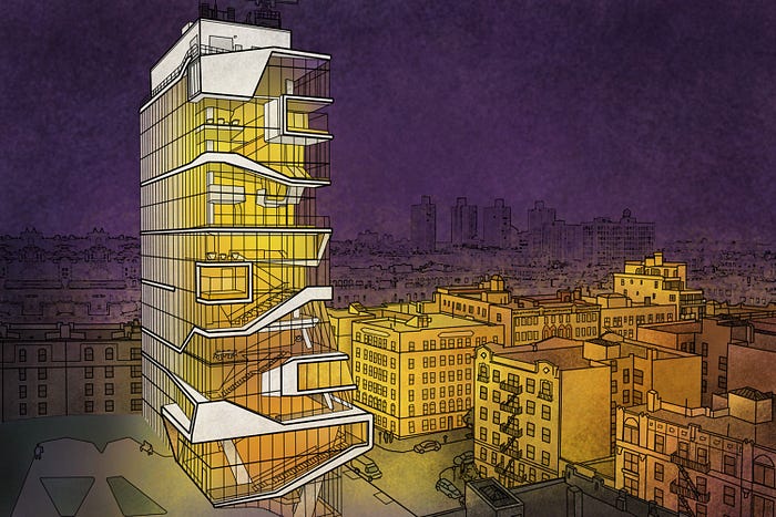
Roy and Diana Vagelos Education Center Columbia Medical School. Diller Scofidio and Renfro. New York. 2016.
This building has strong parallels with Zaha Hadid’s Hong Kong Polytechnic University, but I’ve actually already drawn that one before so moved on to Columbia Medical School’s Education Center. I actually don’t know much about Columbia University other than it’s one of the oldest universities in the United States. Knowledge, however, must run the marathon of exploring new areas of science. Columbia Medical School’s new education center by Diller Scofidio and Renfro of New York exactly captures that forward-thinking view of knowledge. Seeing so much wrong with the modern world, some have argued against such idealistic futuristic themes. But like the other postmodern buildings considered for this piece, creative risk-taking should also be a factor in a building’s architectural merit. Here I think the building finds success as it winds its way up toward the sky. We could have had just another tall rectangular prism had less creative capital been spent, or worse, a classical temple, which would have further limited creativity, like taking all the colours away from a painter. Instead students and researchers have this inspiring building to go to everyday. The interior is treated masterfully, with great care exercised in creating unconventional spaces not normally seen in other building because of the engineering challenges they represent.
— — — — — — — — — —
Blair Birdsell is a design technologist in Vancouver, B.C. Please feel free to follow connect on LinkedIn for more long-form pieces about digital design and sustainability, or on Instagram for a full-throated celebration of architecture.
